Data Visualization
Power BI
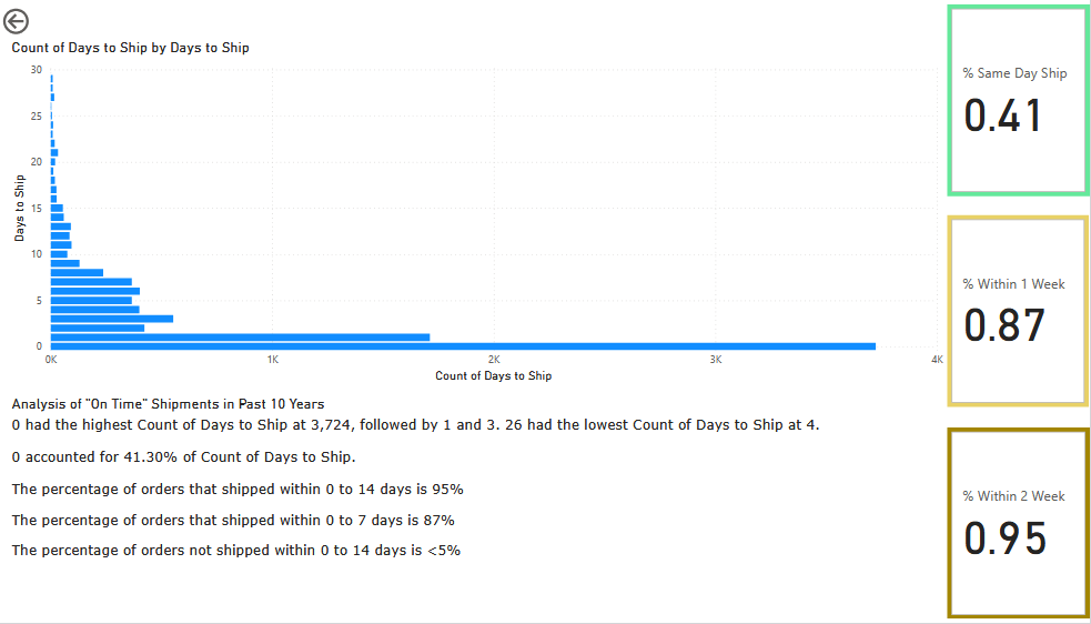
Power BI is an incredibly powerful tool for data visualization and understanding. The above report displays the amount of shipments over a given time that fell within our two week customer commitment, as well as the internal goals of 1 week and same day shipments. Using Power Query I combined two import datasets from both our selling channels to get the shipment information. I then created a measurement for the count of days as well as a parameter for the date, making the report dynamic for multiple use cases.
Microsoft Excel
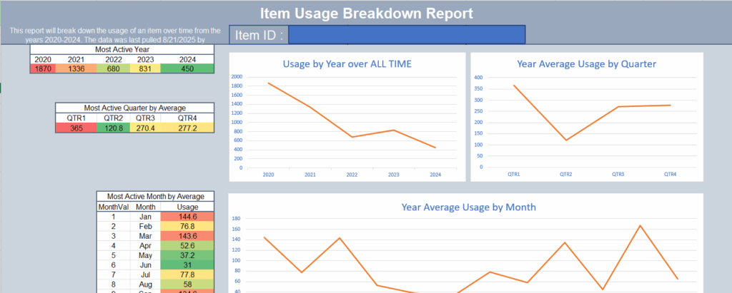
Excel is a fundamental building block for almost all businesses. Through college and later learning, I have become an expert at Excel in all aspects. I can draw data from almost any source, transform the data, and then display the data in highly professional standards. The report pictured above is a dynamic report that used ODBC to integrate with Sage 50 to get historical usage of a product. This information is then integrated with our websites orders data to get accurate usage item predictions.
Data Entry
Excel
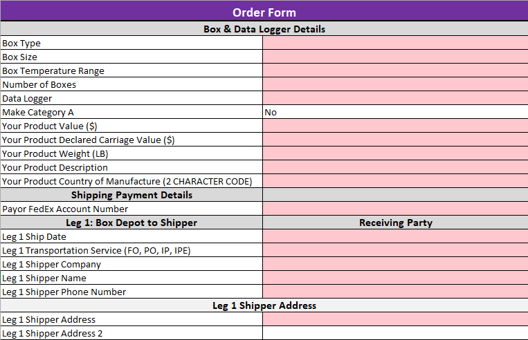
I value data very highly and I also understand that data is valuable at all points. Including the data collection end. I have developed multiple protected and automated templates that streamline data entry, minimize human error, and accelerate processing. This template collects information on three legs of a shipment, generates shipping labels via the FedEx API, and sends API requests using Power Automate to create orders on our websites.